IntervalCoach now builds each athlete's recovery curve from their full history of overnight measurements, rather than from the narrow subset the previous estimator was able to use. In practice that means around a hundred mornings per athlete instead of four or five.
The improvement comes from modelling how the effects of consecutive sessions overlap, which turns days the previous estimator discarded into usable evidence. Depth is now fitted individually for every athlete on the platform, and the recovery rate for every athlete whose data supports one.
The model was validated against mornings it had not seen before release. What follows is how it works, what it measurably improves, and where its limits lie.
What a recovery curve is
A hard session leaves a measurable trace in overnight physiology. HRV falls, resting heart rate rises, sleep quality often declines, and over the following day or two those values return toward baseline. How far they move and how quickly they return is what we model as a recovery curve.
It has two components, and they behave differently enough that the distinction matters throughout:
- Depth. How hard a given kind of session hits you. A VO2max block digs a deeper hole than an easy hour.
- Rate. How quickly you climb back out of it.
That curve feeds your readiness score and produces the "recovered in about X hours" line after a session.
The change: overlapping sessions as evidence
Measuring a decay curve ideally requires a clean observation: one hard session, followed by undisturbed mornings while its effect fades. Real training rarely provides that.
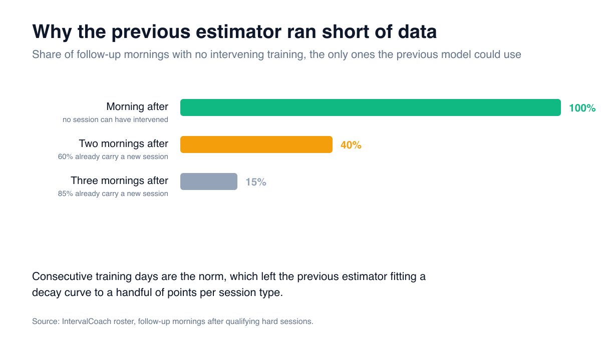
Sixty percent of second mornings and eighty-five percent of third mornings already carry the load of a subsequent session. Requiring clean gaps therefore discards most of the data an athlete generates.
The new estimator fits the entire morning series simultaneously, treating each morning as the sum of everything still decaying:
your morning = sum over recent sessions of depth(session type) × decay(days since)
The idea is not new. Summing the fading effects of past sessions is the impulse-response model Banister and colleagues proposed for training and performance (Australian Journal of Sports Medicine, 1975), the same idea behind the fitness and fatigue numbers most endurance athletes know as CTL and ATL. Applied to overnight HRV and resting heart rate, it turns each session into a fading impulse whose size and speed can be fitted per athlete.
Overlap is no longer treated as contamination to be excluded; it is the structure the model reads. An athlete training five days a week now contributes every one of those mornings to their own curve, which is what raises the usable evidence from a handful of points to roughly 115.
What you get
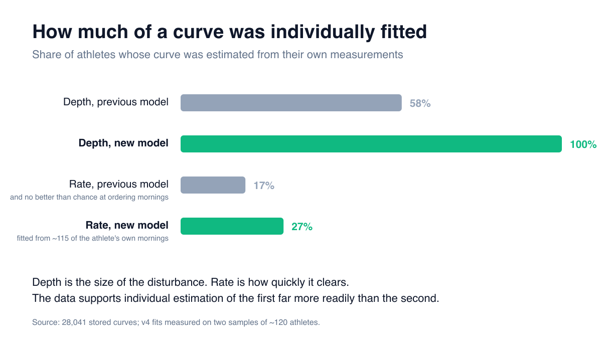
Individually fitted depth for every athlete, up from 58%. How strongly each type of session affects you is now estimated from your own measurements in all cases.
An individually fitted rate for approximately 27% of athletes, up from 17%, and derived from around 115 of their own mornings rather than four or five.
Where an athlete's data does not support an individual rate, the population value is used and the recovery card identifies it as such, so it is always clear which parts of a curve are individually derived.
Why an individual rate is worth estimating
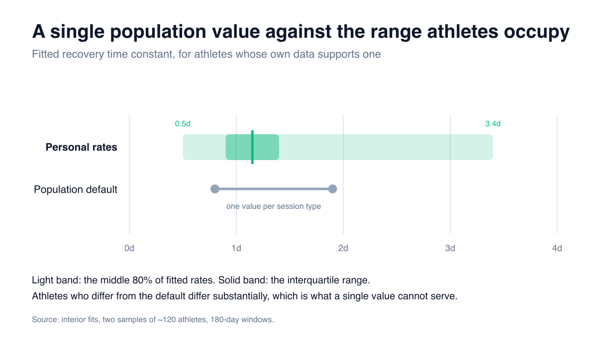
Population defaults range from 0.8 to 1.9 days depending on session type. Athletes whose own data supports an individual rate span 0.5 to 3.4 days. Those who differ from the average differ substantially, and a single value cannot serve both ends of that distribution.
Validated, not just fitted
Fit statistics describe how well a model matches the data it was built from, which is a weaker question than whether it predicts anything. The evaluation is therefore a prediction task.
Each athlete's curve is fitted on the earliest 70% of their sessions and scored on the mornings following the remainder, which the model has not seen. The split is chronological rather than random, because in practice a model is always fitted on the past and applied to the future. Performance is then compared against the population default, against the athlete's own average morning, and against a control that assumes training has no effect.
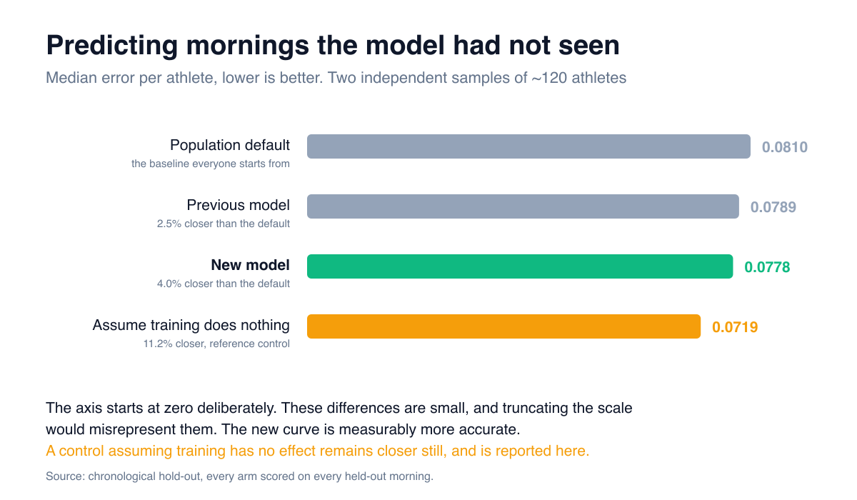
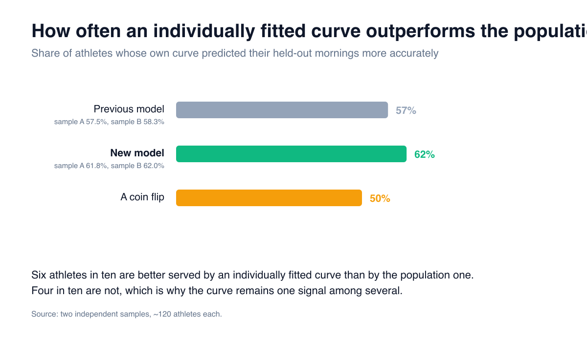
On two independent samples of around 120 athletes each:
- The new curve is more accurate for approximately six athletes in ten.
- Median error falls by about 2% relative to the previous model and 5% relative to the population default.
- Both results replicate across the two samples.
The final bar is the control, and it is the reason the recovery curve remains one input among several rather than a rule in its own right. The readiness score reads HRV, resting heart rate, sleep and the morning check-in alongside it, and an athlete's own reported state is never overridden by the curve. Establishing precisely how much weight a model has earned is what makes it usable.
Two constants we chose not to introduce
Both decisions follow from the same evaluation.
Session size does not receive an exponent. The previous model assumed a session's effect scaled with its size raised to the power 0.6, a value that was reasoned about rather than measured. Size does carry information: sorted into quartiles by each athlete's own typical session, the morning response rises with size in all twelve stimulus-by-sample combinations examined. However, when the exponent is fitted freely, it converges on whichever ceiling the search permits. Raising the limit from 1 to 2 moves the athletes onto the new limit, and a value of 2 would imply that a session twice as large has four times the effect. The parameter is not identifiable from this data, so no value is assigned. Assigning one regardless is how the original 0.6 entered the model.
An infrequent session type cannot dominate the fit. Training is not a controlled experiment: an athlete who performs VO2max work does so in the same weeks as everything else, which leaves those terms nearly collinear and allows the estimation to assign one of them a very large value that the others offset. The fit is regularised, and any depth outside the plausible range for a recovery magnitude falls back to the population value.
What this means for your training
Your curve is individually derived in the component the evidence supports, and the application states which component that is. The recovery card identifies each curve as individually fitted or as a population default.
Your readiness score receives a better input, at the same weight, with a more accurate value underneath it.
The evaluation is part of the product. Every figure in this post comes from tooling that runs inside IntervalCoach and can be re-run against the entire platform at any time, which means the next version of this model must outperform this one on the same test.
What comes next
The evaluation raises a further question: whether an exponential decay from each session is the correct functional form at all. The alternative worth testing is a curve that rises before it falls, since the day immediately after a hard session is not always the most disrupted one. That comparison runs through the same evaluation harness, on the same held-out mornings, and will either outperform the current model or it will not.
If you find something in IntervalCoach that does not hold up to scrutiny, please tell us. It remains the most direct route to improving it.
Frequently asked questions
What is a recovery curve in IntervalCoach?
It models how a training session disturbs overnight physiology and how quickly those values return to baseline. It has two components: the size of the disturbance for a given type of session, and the rate at which it clears. The curve feeds the readiness score and the 'recovered in about X hours' estimate shown after a session.
What changed in the new recovery model?
It models overlapping sessions directly, so every recorded morning becomes usable evidence rather than only the rare ones with no intervening training. That raises an athlete from a handful of usable data points to around 115. Depth is now individually fitted for every athlete, up from about 58%, and the recovery rate for approximately 27%, up from 17%. Where an athlete's data does not support an individual rate, the population value is used and identified as such.
How much better is the new model?
On mornings the model had never seen, the new curve is more accurate for about six athletes in ten, and the median error falls by roughly 2% against the previous model and 5% against the population default. Both results replicate on two independent samples of around 120 athletes each.
Does the size of a session change how long you need to recover?
Size does carry information: sorted into quartiles by each athlete's own typical session, the morning response rises with size across every stimulus examined. What cannot yet be established is how it scales. When the model is allowed to fit that relationship freely, it converges on whichever limit the search permits, which means the parameter is not identifiable from this data rather than zero. Recovery time therefore depends on the type of session rather than its size, and the reason is stated rather than the question being presented as settled.
Does the recovery curve decide my training?
It is one input among several into the readiness score, alongside HRV, resting heart rate, sleep and the morning check-in. That is a design decision supported by measurement: the curve is a useful signal but a weak predictor on its own, so it is never given a training rule of its own and never overrides an athlete's reported state.
How do you test a recovery model?
Each athlete's curve is fitted on the earliest 70% of their sessions and scored on the mornings following the remainder, which the model has not seen. The split is chronological rather than random, because a model is always fitted on the past and applied to the future. Performance is then compared against the population default, against the athlete's own average morning, and against a control assuming training has no effect. This tooling runs inside IntervalCoach and can be re-run against the entire platform at any time.